- Crypto Is Easy
- Posts
- Exposing Bitcoin Data Models and Cycle Theories: Good, Bad, and Ugly
Exposing Bitcoin Data Models and Cycle Theories: Good, Bad, and Ugly
Are you buying into these?

Crypto is full of data models and theories about when the market will reach its peak and bottom.
Are they still valid? Do they still work? Did they ever work? Can you plan around them?
Which one is best? Which gets closest? How do you know which to follow or how to use each of them?
This report goes through all of the major models to answer those questions. Read below for the definitive look at the most popular data models and cycle theories. Or, listen to the AI bots talk about it on their podcast, which is linked below.
Table of Contents
Halving Cycle: Myth or Reality?
Four-Year Cycle: Close Enough for Government Work
Logarithmic Growth Curves: Correct But Irrelevant
Pi Cycle: Valid but Not in the Way You Think
Institutions Cycle: A Speculative Model
Expanding Cycles: Once Maligned, Now Valid (Kinda)
On-Chain Models—Do They Predict Bitcoin's Peak?
Power Law and Stock-to-Flow: Which is Best?
U2R Model: the Only Model That's Always Right
Also available as an AI podcast!
Bitcoin’s Halving Cycle: Myth or Reality?
What is the halving cycle?
To answer that question, you have to understand how Bitcoin mining works.
Constant sellers
Bitcoin miners get rewards in the form of new Bitcoins.
They usually sell most of these Bitcoins to pay for the costs that go into mining. Even if they’re in a strong financial position, they can’t resist the temptation to make money. That’s the whole point of mining.
(Some public miners stash Bitcoins, but they hold a small portion of the overall supply that goes to miners.)
In general, the more Bitcoins the miners have, the more they’ll sell. They’re a drag on Bitcoin’s price.
Fear not!
Every four years, miner rewards get cut in half. This is called the halving.
When miners get fewer Bitcoins, they have fewer Bitcoins to sell. As a result, you get less selling pressure on the market.
Not as potent as before, but potent enough
We’ve had four of these cuts already, bringing Bitcoin rewards down from 50 BTC to 3.125 BTC for each block.
That sounds like a bad deal for miners, but the value of those rewards goes up as Bitcoin’s market cap grows.
While fewer in number, those new Bitcoins are still worth more than $2 billion each month (more as the price goes up). They get fewer Bitcoins but make more money.
You can see this in the parabolic, upward trend in the USD value of miner rewards.

As such, the halving remains potent because:
Bitcoin’s price increases parabolically, giving the miners ample purchasing power.
Miners will always sell regardless of market conditions.
Same pattern each time
Because the halving happens on a fixed schedule, you can compare price movements from each halving period to the next. The big “bull run” happens within one year of the halving.

The market may go higher before the next halving, but most of the gains are gone by then.
Even in 2017, the exception to that rule, when Bitcoin’s price rose 6x after the one-year timeframe, the returns barely beat the 5x post-halving leap from $600 to $3,000.
On top of that, the ebbs and flows follow a similar path with a similar structure. As such, you can frame some long-term expectations.
This model may not give you an exact price or time for any moves, but it can show you a general path forward.
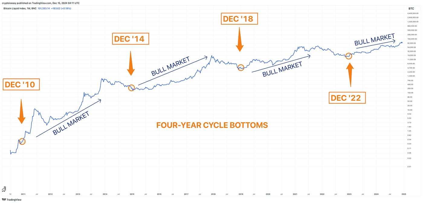
Bitcoin’s Four-Year Cycle: Close Enough for Government Work
I’ve seen several variations of the four-year cycle.
For this report, we’re talking about the general concept of tops and bottoms that come at roughly the same time every 4 years.
The most well-known variation probably comes from Bob Loukas, where the bottoms come in December every four years, starting with 2010. From there, we get a bull market that lasts approximately three years. Like so:
I reached out to Bob before I wrote this section. One of his representatives said he was too busy to answer my questions or review the content.
That’s ok!
We’ll use Bob’s version as the example because it’s popular, but the observations and conclusions can apply to any version.
Like clockwork?
The basic idea: buy in December every four years starting with 2010 and sell in December every four years starting with 2013.
Simple, right?
On the buy side, look at this chart:

In 2010, 2018, and 2022, you’d do great. “Up only,” as they say, with only a small, brief drop in 2018.
In 2014, you’d suffer a 50% crash and not get back to even until 2016. You’d miss a chance to buy at a massive discount in 2015. You’d be “right” and do worse than somebody who bought in 2015.
Should we assume 2014 was an aberration? Or, should we assume the other three Decembers are coincidences drawn from a small sample size? Can we expect the bottom to come at a different time in this cycle or the next, as it did in 2014?
You don’t know. Nobody does.
On the sell side, the results are mixed. With this model, you’re expected to sell in December three years after the bottom.
In 2013, it worked out great if you sold at 12:01 am on December 1. You would have taken a 65% hit if you had sold a few weeks later.
See for yourself:

That’s quite a swing.
In 2017, you would have missed a raging altseason and, depending on what day you sold, potentially another 100% gain on your Bitcoin.
In 2021, you might have sold at a lower price than you bought during that summer, even though the four-cycle worked.
All three times, you were “right.” Two of those three times, you missed out on a lot of money.
Timing is everything
You have the same problem if you align your cycle to January or November.
For example, if you shift the timing to January, you’d sell after every peak, sometimes 40% lower.
Move it to November and you’d have done better, but each time you would have sold right before the market ran higher (potentially much higher).
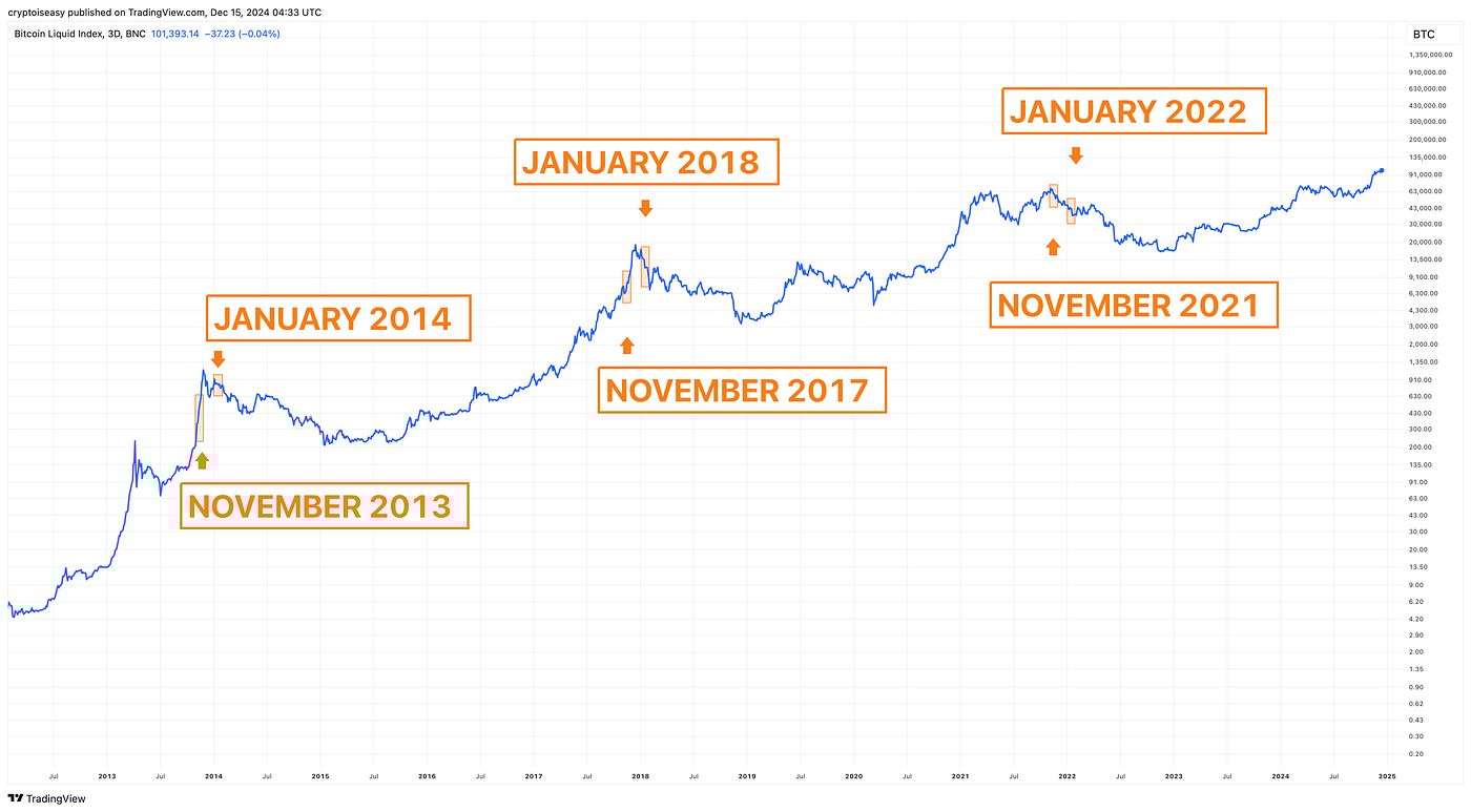
On the bottoms, you’d have gotten a hodgepodge of results, some better and some worse.
Ol’ faithful
The four-year cycle is a valid pattern. It’s dependable and reliable.
It’s also imprecise. While you know you’ll do okay buying at every bottom and selling at every top, you can’t say the same for any time in between. You may also leave a lot of money on the table.
Bitcoin’s price goes up and down by 50% during peaks and bottoms. You can follow the four-year cycle and still underperform the market or anybody who follows my plan.
And that’s assuming everything works out how it should, which is no guarantee. Four-year cycle peaks can be left- or right-translated (i.e., early or late).
In other words, Bitcoin’s peak can come at any time during the four-year cycle. Its bottom can come 50% lower or higher than you expect.
Plan accordingly.
Bitcoin Logarithmic Growth Curve Model: Correct But Irrelevant
As Bitcoin evolves, its moves get less extreme.
You can see this on a chart with the logarithmic projection, which plots Bitcoin’s parabolic growth as rising curves rather than a plain price chart’s infinite vectors.
Many variations exist. For this post, let’s use the version from Dave the Wave. His curves are elegant, effective, and easy to follow. They also make sense conceptually. Here they are:

You can visit his Substack for more information.
I reached out to Dave for input, but didn’t get a response. Feel free to send this to him. I’m probably not going to tell you anything he hasn’t.
A wide range of possibilities
To hit the top line in 2025, Bitcoin’s price will have to reach $200,000 at the minimum and $260,000 at the maximum. The exact price depends on when Bitcoin hits. The longer it takes, the higher the target price gets . . .
. . . assuming Bitcoin’s price reaches the top line at all.
In 2021, it didn’t.
The first attempt reached $65k when the top line hit $85k, roughly 15% short of its target.
The second attempt reached $69k when the top line hit $98k, almost 30% short of its target. To wit:
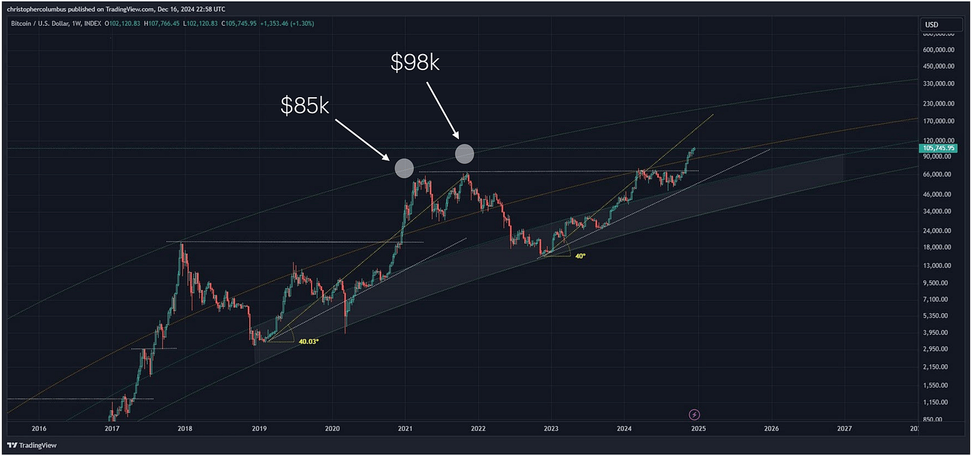
Let’s apply those 30% and 15% deviations to get our 2025 range of $200,000 to $260,000.
That puts our potential peak as low as $140,000, 30% less than $200k, to as high as $221,000, 15% less than $260,000.
Those are reasonable expectations, not hypothetical outcomes. They already happened once.
In 2011, the curves missed, too. At that year’s peak, the lines hit $40–50 (hard to tell), but Bitcoin’s price topped out at $31. A comparable miss today puts us at a peak of $124,000, not too far from January’s top.
Other versions of the logarithmic growth curves have already hit their peaks. For example:

You can follow the logarithmic growth curves and still miss every peak.
The bottoms fit more tightly, but Bitcoin’s price briefly dipped below the curves in 2015 and 2020. Plan accordingly!
Your eyes deceive you
Keep in mind, the lines converge visually, not mathematically or directionally.
This is because the logarithmic projection uses an exponentially growing axis to display price movements.
When you plot logarithmic growth curves as normal lines on a normal chart, you can see they don’t converge. Compare the two charts below:

The lines might converge at some point. We’ll have to see where they end up at the bottom of the next major bottom. As of this post, they go their separate ways forever.
Logarithmic growth curves are a visualization technique to illustrate a larger concept. Your brain has to account for this optical illusion.
Not trying to be an asymptote, but . . .
Why do we have to have logarithmic growth expectations? What about the exponential “S-curve,” another geometric concept that can fit?
Technology adoption generally follows this pattern, like so:
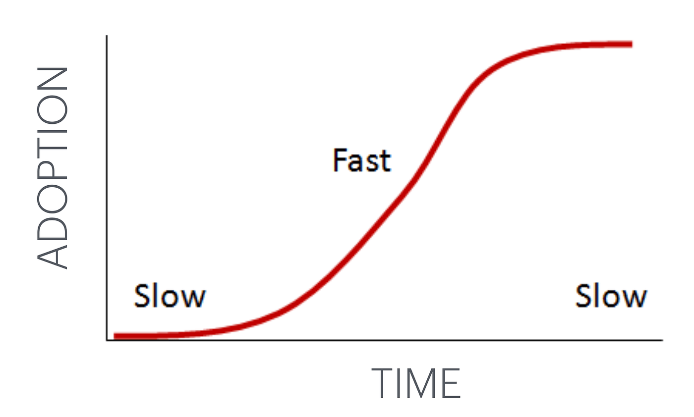
Since Bitcoin is a monetary technology, why can’t its price follow suit?
It’s no more necessary to follow a logarithmic curve than an S-curve. What makes one geometric concept better than the other?
Bitcoin’s Pi Cycle: Valid but Not in the Way You Think
The Pi Cycle is an extrapolation of two moving averages plotted as lines on a price chart.
When those lines cross, they mark the big, long-term peaks and bottoms—or so the thinking goes.
You can put these lines together in lots of ways, for example:
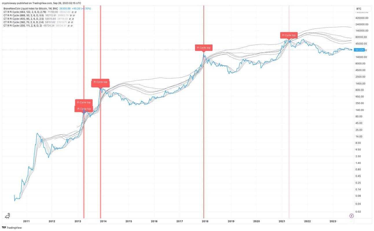
For this post, we’ll pick the most common, “classic” variation for the tops and bottoms.
On Top
The classic Pi Cycle top is a formula based on the 350-day and 111-day moving averages, with crosses marked as vertical red lines on this chart.
The lines crossed four times, twice at the top of a major market cycle and twice during smaller upswings. See the chart below, with the crosses marked with triangles and the tops flagged in purple.
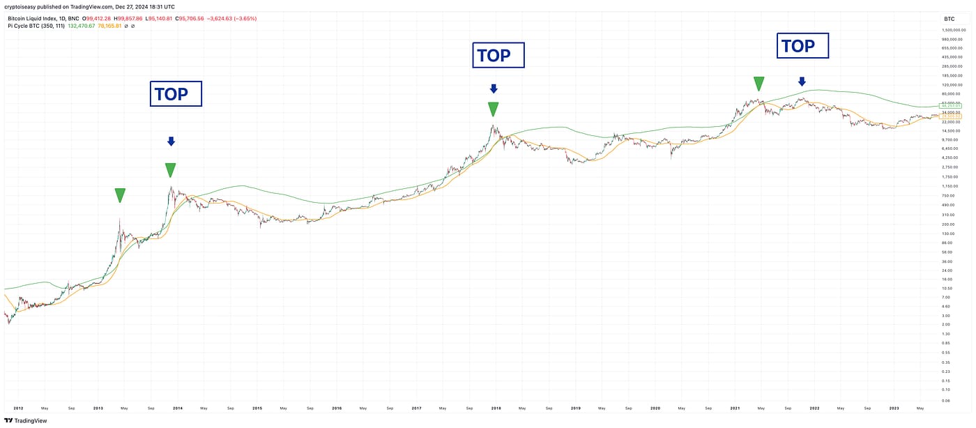
Why does the chart end in 2023?
Because the lines haven’t crossed since April 2021.
On bottom
The classic Pi Cycle bottom is a formula based on the 471-day and 150-day moving averages. Same idea, but the lines cross at the bottoms instead of the tops.
This metric caught two of the four market cycle bottoms. See the chart below, with the crosses marked with triangles and the bottoms marked with arrows.
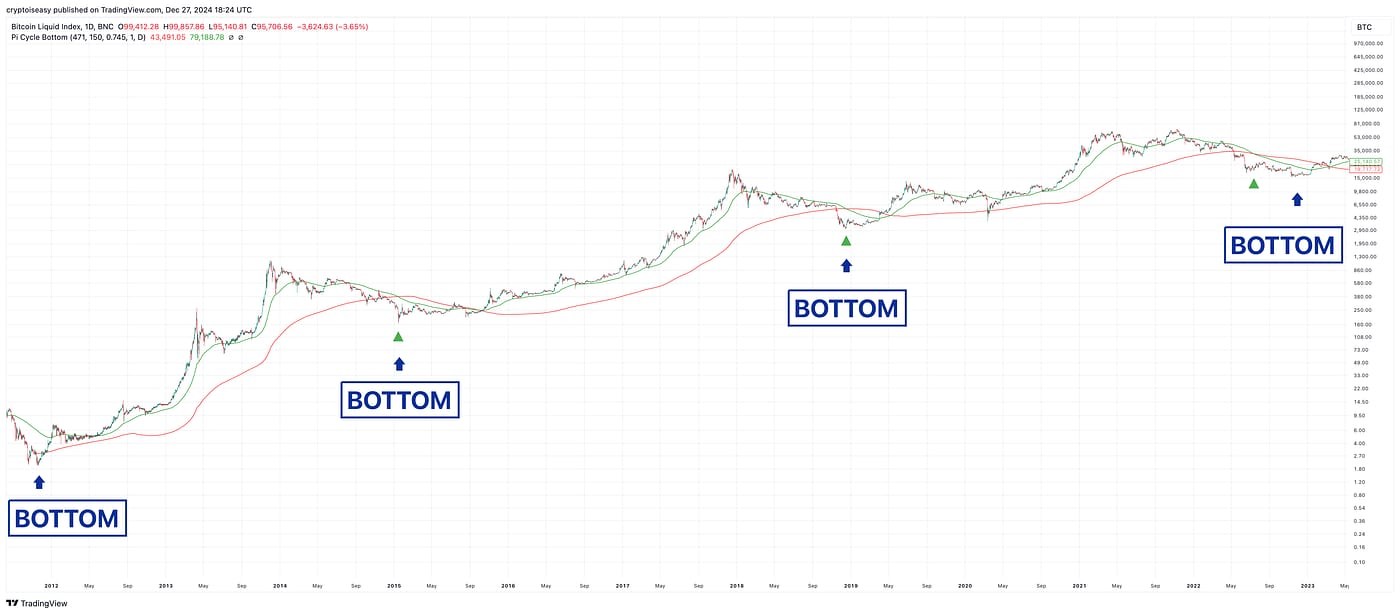
On both the top and bottom, the Pi Cycle boasts a 50% success rate, on par with most trading signals.
Past performance . . .
Do you notice how the Pi Cycle top crosses get progressively tighter and the lines make smaller loops over time?
Should we follow that pattern, the lines may never cross again. You can see this more clearly in the video below, a snippet from an old market update.
Dismiss this at your peril
Does a 50% success rate and diminishing clarity mean we should throw the Pi Cycle indicators out?
No!
The Pi Cycles tell you when the market’s too hot or cold. The market always goes in the opposite direction soon after the lines cross.
You can confidently sell when you see the Pi Cycle top and confidently buy when you see the Pi Cycle bottom.
The problem comes on the other side of the deal.
When you sell the fake peaks, when do you buy in again? When you buy the fake bottoms, what do you do when the market keeps going lower?
As long as you have a plan for those inevitabilities, you can do well with the Pi cycle.
(Free idea: split the difference! Sell 50% of your Bitcoin when the Pi Cycle peaks. Buy 50% of your allocation when the Pi Cycle bottoms.)
You can get the Pi Cycle indicators for free on TradingView:
Bitcoin’s Liquidity Cycles: A Fudgy Price Model
Some analysts say global liquidity—the world’s money supply—drives the market up and down.
To them, everything is “macro.” Only central bank actions matter for asset prices. Are central banks creating more money or not? That’s all you need to know.
Define your terms
Sounds great. One question:
How do you measure liquidity?
Do you use the old M2, which included only currency and money in checking and savings accounts, or the new M2, which adds money market funds and time deposits?
What about M3, the “broad” money supply?
Do you include the assets that central banks hold? Do any of these metrics matter now that the global financial system runs on debt and derivatives rather than actual currency in the real economy?
What about currency swaps and reverse repos? These activities provide liquidity but don’t fall under conventional measures of money supply.
Fuzzy math
Anyway, how do you make decisions based on this model? The world’s M2 hardly ever falls and year-over-year changes seem to make no difference to the overall economy.
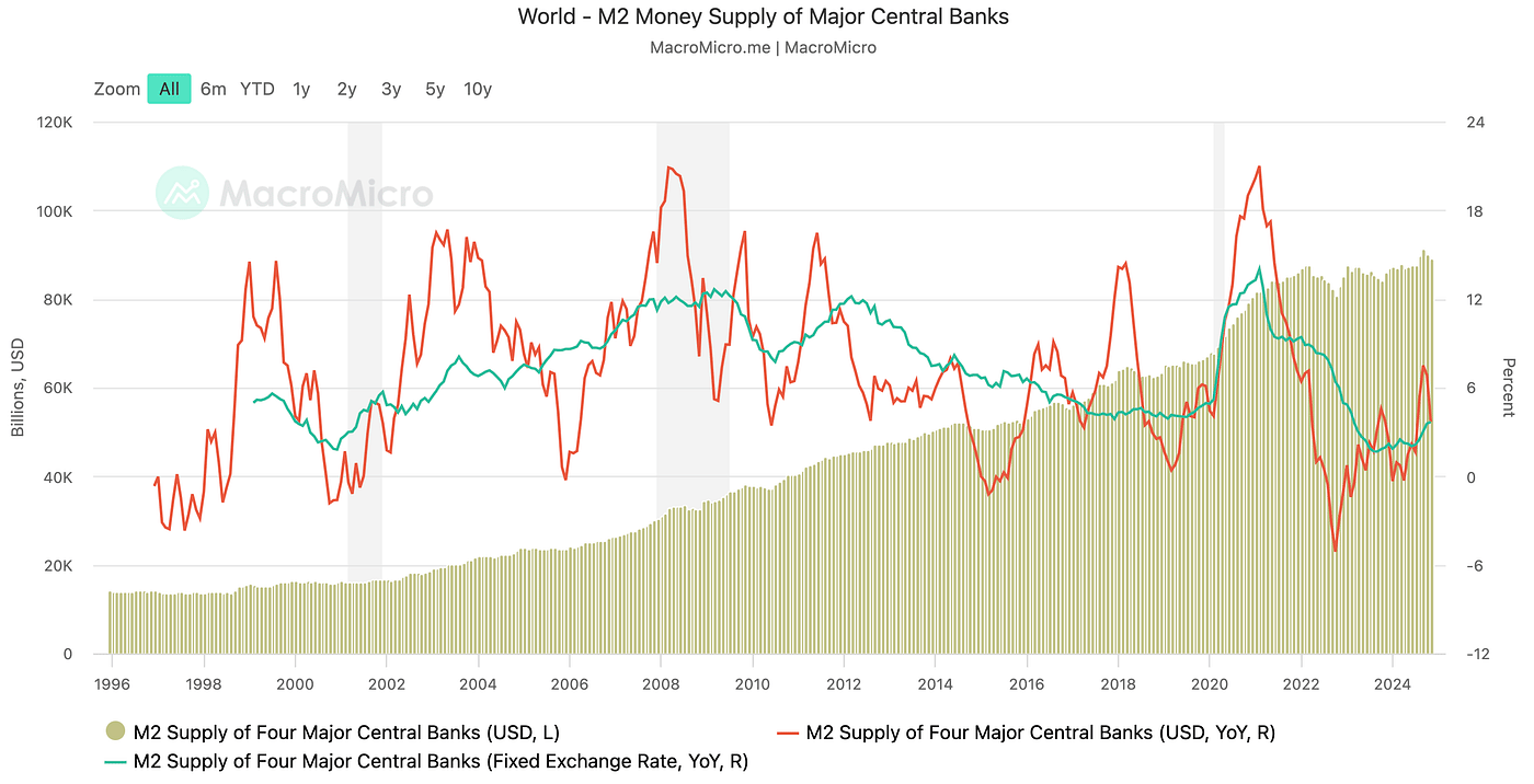
When plotting the peaks, you find no alignment between crypto prices and the year-over-year change or the total amount of M2.
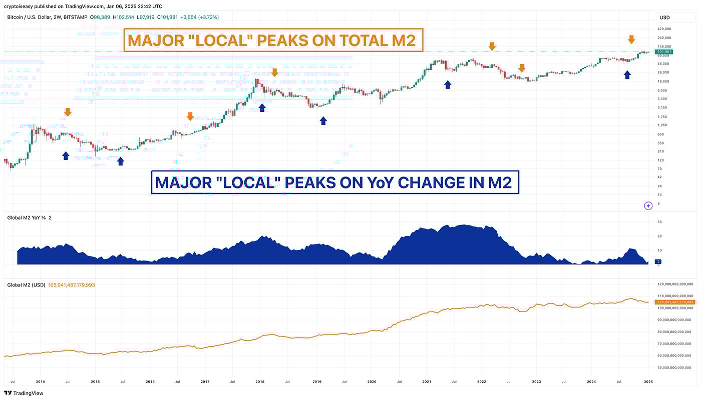
That’s a bit of a “chart crime,” but it makes the point well enough. Crypto’s moves come before, during, and after the corresponding changes in liquidity.
Certainly, it's easier for crypto prices to go up when the money supply grows. The crypto market will always absorb liquidity.
That doesn't mean liquidity frameworks help us navigate the market or improve our timing.
Another view
CrossBorder Capital published a chart that shows oscillating cycles over 65-month timeframes.
In this chart, “liquidity” includes central bank interventions, shadow credit markets, corporate cash flow, collateral-based wholesale and repo market activity, and net foreign flows.
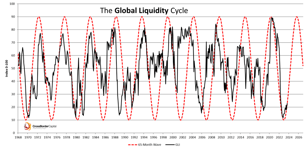
Sounds good, looks neat, but when you look at the difference between the oscillating lines and actual liquidity, you don’t see much synchronization. Liquidity can deviate from the oscillating lines for years.
It was supposed to peak in 2004, 2010, 2015, and 2020, with bottoms in 2002, 2007, 2012, 2018, and 2023.
It actually peaked in 2003, 2009, 2014, and 2020. Bottoms were more erratic. Only 25% of the years matched, and you had to wait 12 months to find out which one!
Only one year, 2020, matches the changes in liquidity. And we all know how that went!
Feel free to shift the black line and the dotted lines forward and backward to show lag or lead. You still won't get a close match.
Coincidence or nonsense?
Conceptually, these models make sense.
When you try to apply them to the real world or build expectations based on them, you set yourself up for a rough time. Your plans could be off by a year, with disastrous results.
Liquidity changes often enough to make these models useless.
You can plan for a bottom in 2026, but liquidity models allow that bottom to come as soon as today or as late as the middle of 2027.
The Benner chart says to sell in 2026 and look for the next great buying opportunity in 2032.
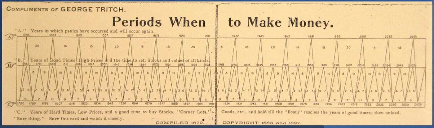
This one misses tops and bottoms by as much as 3 years!
According to the four-year and halving cycles, 2026 will be a bear market. Benner says to sell in 2026, which is the worst thing you can do in a bear market.
What’s missing?
These models may work great for one type of asset, not another. But they're so imprecise that you can't say which asset’s movements it will predict. Some assets are not correlated with others.
How do you account for wealth transfers from old people to young people? Old people prefer stocks and bonds. Young people prefer crypto and real estate.
What about other nuances and conditions that don’t get captured in this model? Global pandemics? World wars? Demographic changes?
And why can’t any of these models tell you what the world’s liquidity will be in six months?
Bitcoin’s Institutions Cycle: A Speculative Model
The institutional model says that Bitcoin’s cycles follow the movements of investment funds and entities that manage money on behalf of others. AKA, “institutions.”
Those who redeem us from the pit
Ah, institutions. Our saviors! Just like in 2021, when experts said they wouldn’t let the market crash.
Now that Wall Street has given them spot Bitcoin ETFs, they’ll flood the market with cash, pump our narratives, bid up Bitcoin’s price, and send our bags to the moon!
Throw out all your models. Cycles are dead. A steady flow of institutional capital will keep the market afloat forever. No more bear markets!
If you’ve read Bitcoin or Bust: Wall Street’s Entry Into Cryptocurrency, you know my thoughts about “institutions.” No point rehashing here.
A spot Bitcoin ETF is simply a way for Wall Street to make money off people who don’t want to take five minutes to learn how to set up a Bitcoin wallet.
Fortunately for Wall Street, many people don’t want to take five minutes to learn how to set up a Bitcoin wallet. They’ll gladly pay a small fee or premium for somebody to do that for them.
Large financial entities like pension funds and corporations need somebody to do that for them. They won't trust the company's Bitcoins to a hardware wallet or crypto startup. Some bylaws or local regulations don't allow them to, anyway.
In and out
These ETFs have already captured $36 billion since launching in early 2024. Not too shabby!
Those inflows are mostly not institutional capital. Some measures show that up to 85% of flows come from retail investors through self-directed accounts. Of the institutions that disclose their ETF holdings to the US government, more than half are hedge funds—not the kinds of entities that take long-term positions on the market.
You will find some legacy financial entities mixed in there, but they manage money for others so they can’t take the same risks as you or I.
The people who run these entities may buy Bitcoin with their own money. They’re not putting somebody else’s money into the market without a very, very good reason to do so. They also won’t stick around for bear markets.
Most importantly:
They can move money out of the market as quickly as they move it in.
When the investment board says to buy $1 million in BTC, they’ll buy 10 tokens and call it a day. They don’t care that they could’ve gotten 20 for the same amount last year. They’re not trying to build wealth or stack sats. They’re trying to get more of their government’s money.
When that allocation rises to $1.3 million, they’ll sell $300,000 and book a 30% gain That’s a banner year!
As we’ve seen with Tesla in 2021 and numerous disclosures since then, entities have no qualms about selling at any time they want.

Passengers, not drivers
Generally speaking, institutions can’t steer the market away from danger. Grayscale didn’t save anybody in 2021. BlackRock didn’t save anybody in 2024. Strategy฿ won’t save anybody in 2026.
You dream of HODLers investing for the long run. Institutional capital will sell fairly quickly once Bitcoin’s price goes up—or, potentially, down.
There is no way to plan for that or build models to predict what will happen.
Bitcoin’s Expanding Cycles: Once Maligned, Now Valid (Kinda)
What does the expanding cycles theory say?
Cycles get longer and shallower as Bitcoin’s market cap grows and the asset acquires more long-term investors.
Upswings last longer from one peak to the next, as do bear markets. Downturns get less extreme, as do bull markets.
While many have abandoned this idea, you can see this play out in the evolution of price action over the years.

These cycles also correspond with pivotal changes in market participants.
Cycle 1: hobbyists
Cycle 2: drug dealers and speculators
Cycle 3: tech bros and retail investors
Cycle 4: institutions and El Salvador
Cycle 5: Wall Street and nation-states
Beauty is in the eye of the beholder
Unlike the four-year cycle, you don’t need to fudge the timing of the peaks and bottoms. You can make this model work no matter what Bitcoin’s price does. It all depends on where you draw the lines.
Each cycle needs to get longer, but there’s no limit or standard for what “longer” means.
You can also fudge the “peaks” and “bottoms.”
Bitcoin’s price fell 85% from April to May 2013. It fell 73% from June 2019 to March 2020, 65% from April to June 2021, and 77% from November 2021 to November 2022.
Which one counts as a “peak” and “bottom?”
(For comparison, the “four-year cycle” ignores three of the drops mentioned above.)
The gains from bottom to top shrink with each cycle.
Cycle 2 started with a 95% drop. Cycle 3 started with an 86% drop. Cycle 4 started with an 83% drop. Cycle 5 started with a 33% drop.
Cycle 2 had two 80% crashes. Cycle 3 had two 70% crashes and numerous 40% crashes. Cycle 4 had three 50% crashes and numerous 25% crashes.
Hopefully, you get the idea. It’s arbitrary. As you split up the cycles into longer and longer chunks, you can make them all fit.
Since all timeframes and price swings fit, the model is valid.
Do On-Chain Models Predict Bitcoin’s Peak? The Data Says ‘No and Maybe’
Let’s check on some popular on-chain models (models drawn from movements of Bitcoins and their relation to price and time).
Pick your chart, pick your fate
On-chain metrics get a lot of buzz and rightfully so. They’re a treasure trove of insights into market behaviors and expectations.
As far as predicting peaks?
Not so much.
They won’t tell you anything about the future. There’s no guarantee you will make any money with them.
Some examples:
Net Unrealized Profit and Loss (NUPL). NUPL compares the paper gains people may want to sell for profit vs. the paper losses people may want to sit through when the market goes up and down. The peaks trend down slightly over time.
On this metric, we came close to a peak in February and December 2024.

The problem?
NUPL’s levels are so large that a wide range of prices fits the “peak.” Extreme readings can last for months, with swings of 50% to 100% higher before a peak.
2-Year Moving Average Multiplier. According to this indicator, we don’t need to think about a peak until at least $260,000.

The problem is, we haven’t touched the top of that metric since 2017 and other peaks came well after we crossed above it.
Short-Term Realized Cap HODL Waves. The short-term Realized Cap HODL Waves show the proportion of market participants who bought within the past month.
The most recent spike came close to the long-term trendline.

Sounds scary, but we need to fudge for the +-20% of Bitcoins that reflect the shuffling of ETF inventory rather than any actual behaviors of HODLers and users.
How much do you fudge? Nobody knows. If you’re off by too much, you mess everything up.
You also have to account for momentum that can carry the market higher after the waves reach this trendline, as we saw in 2021.
Reserve Risk. This metric imputes price and HODLing patterns to reflect the relative confidence of long-term holders in further upside. The higher it goes, the less confidence they have.
While this metric mitigates the skew from Wall Street ETFs, it offers no neat, tidy trendlines. All we know is that the extremes shrink as Bitcoin’s price range shrinks and HODL behaviors change. As such, we have to look at a range of values.
That range is quite wide! Each of the three trendlines below can fit, yet they represent a price range of $109,000 to $188,000.

Where do you draw the line?
Relative Unrealized Profit. This metric captures all the transactions people did not make, imputing the amount they could profit if they chose to cash out, relative to Bitcoin’s total market cap.
This metric will touch the top trendline if Bitcoin’s price goes up to $130,000 instantly.

A far cry from the $260,000 of the 2MA multiplier and way off from its cousin, NUPL.
Even if that happens, Bitcoin’s price can go higher later. In 2021, this metric peaked in April, but Bitcoin’s price made a new all-time high later that year!
Timing is everything
I could go on with other metrics, e.g., the MVRV Z-Score, where the peak drops each cycle but without a clear trendline to draw, or the Mayer Multiple, which is all over the place.

On-chain metrics won’t tell you the price and time the market will peak.
Perhaps we don’t need to set our expectations so high. Bitcoin’s price will move up and down by 50% at peaks and bottoms. Maybe, close enough is good enough.
Bitcoin’s Power Law and Stock-to-Flow Models: Which is Best?
Many adhere to Stock to Flow (S2F) and Power Law.
Stock to flow
This model is too sophisticated to explain. It’s a bunch of maths rolled into a chart, like so:

The creator changed the formula along the way. Hopefully, it will be the same formula when you see this report.
So far, it’s had amazing accuracy. Bitcoin’s price is always between 400% higher or 50% lower than S2F’s predicts, often for months.
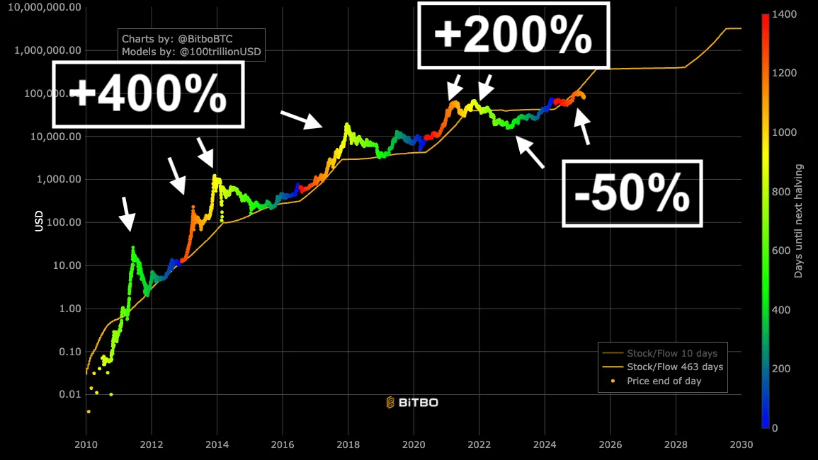
How do you make any useful decisions based on that?
You can’t. S2F covers a wide range of prices.
As of today, the next peak could be as high as $400,000 — unless we already hit our peak at $109,000, which is also within the model’s accuracy range (and, coincidentally, an exact touch of the S2F line in January).
Power Law
The power law is even better, as this model measures how far Bitcoin’s price wanders from the middle line. Check it out:

With this model, you can tell when Bitcoin’s trading at a premium or a discount. As a bonus, you can expect Bitcoin’s price to always regress to the middle line.
At first blush, you’d think this would give you the key to success. Sell when Bitcoin’s at a premium and buy at a discount. Right?
The problem with that approach relates to the trajectory of the chart. Its lines always rise and Bitcoin’s price doesn’t always reach the top line.
You can try to sell when Bitcoin’s price drifts too high, but what do you consider “high?”
If you set your limit too high, you’ll miss some major peaks when the lines don’t connect. You’ll have to HODL for months or years while the market drops, just like you did in April 2013, all of 2021, and potentially now.
The bottom trendline missed the 2011, 2014, and 2018 bottoms but gave you great value once you started buying.
Power Law and S2F are great tools for your toolkit, but they don’t predict anything.
U2R Model for Bitcoin’s Price: the Only Model That’s Always Right
Can I tell you about my proprietary “Up and to the Right” model? I created it myself.
U2 what?
U2R replaces data and analysis with a line on a chart. I drew it with the TradingView “curve” tool. No math, data, or science.
Take a look:

At all times, Bitcoin’s price will be at, above, or below that black line.
Whenever Bitcoin’s price moves higher or lower than the black line, expect it to eventually revert to the black line.
Mark, you’re kidding, right?
No. I’m dead serious.
Bitcoin’s price has oscillated around U2R’s black line for its entire history.
Every time Bitcoin’s price rises too far above or below that line, it returns to that line.
When I shared U2R with PlanC, the ultimate power law advocate, he praised its similarity to the power law, though he later deleted this statement, as you can see in this screenshot.

Know your role
Does that mean you should make any decisions based on U2R?
No.
Do I make decisions based on U2R?
No.
Should anybody make decisions based on U2R?
No.
Mark, why are you giving us models that don’t predict price or help us make decisions?
I’m just trying to fit in with everybody else.
Those other predictions, theories, and data models do not tell you what Bitcoin’s price will be on any given day, when it will peak, or what price will mark its bottom.
As such, U2R is as valid as any other model.
Poppycock and fiddlenuts!
When it comes to planning, don’t worry about data models or cycle theories.
They’re all great, but they won’t help you accomplish your goals. The market is complex and unpredictable. Finding the perfect model is like searching for a unicorn.
Does that mean you should ignore them?
No. Each one gives you a unique and relevant insight into the market.
Sometimes, those insights are whimsical and unrealistic. Sometimes, they are prescient and valuable.
They all have their flaws. Dismiss them at your peril and accept what they can—and can't—do.
With all these models trying to figure out where Bitcoin is going, maybe it’s more important to figure out why we’re so obsessed with predicting the peaks and bottoms in the first place.
What does that say about ourselves and our expectations? In setting our expectations so high, do we set ourselves up for a letdown when they fail?
Maybe the problem isn’t the models.
Maybe the problem is us.
Relax and enjoy the ride!
Reply